Project: Multi-Format Artwork Recreation for Global Campaign Client Collaboration: GREAT Campaign Team + Rockstar Games IP Reference: Red Dead Redemption
Overview
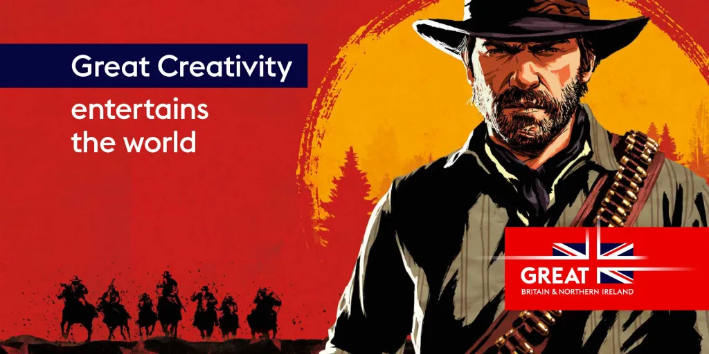
This project focused on retouching, reformatting, and re-illustrating iconic poster artwork inspired by Red Dead Redemption to support a global promotional campaign. The objective was to maintain the original artistic integrity while adapting visuals across multiple formats, channels, and international markets.
Working alongside the GREAT Campaign partnership team, the project required blending creative storytelling, technical precision, and brand alignment at scale.
Objectives
Recreate and enhance original poster artwork for multi-platform use
Adapt designs across various formats and aspect ratios (OOH, digital, social, print)
Maintain brand authenticity and recognisable visual style
Collaborate with stakeholders to ensure alignment with global campaign messaging
Deliver assets optimised for international audiences
Creative Approach
1. Artwork Reconstruction
Decompiled original poster compositions into layered structures
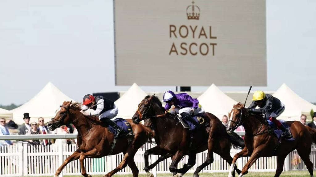
Ascot Racecourse is one of the most iconic sporting venues in the UK, founded in 1711 and attracting hundreds of thousands of visitors each year.
While globally recognised for horse racing and Royal Ascot, the venue also hosts a wide range of non-racing events, including corporate conferences, weddings, exhibitions, and private functions.
The purpose of this project was to create a high-impact promotional video that repositioned Ascot as a premium, multi-purpose events destination, not just a racecourse.
Storytelling Showing experiences (not just spaces) drives stronger engagement Multi-Audience Messaging is Key One video can serve multiple segments if structured correctly Premium Venues Require Premium Visuals High production quality directly impacts brand perception
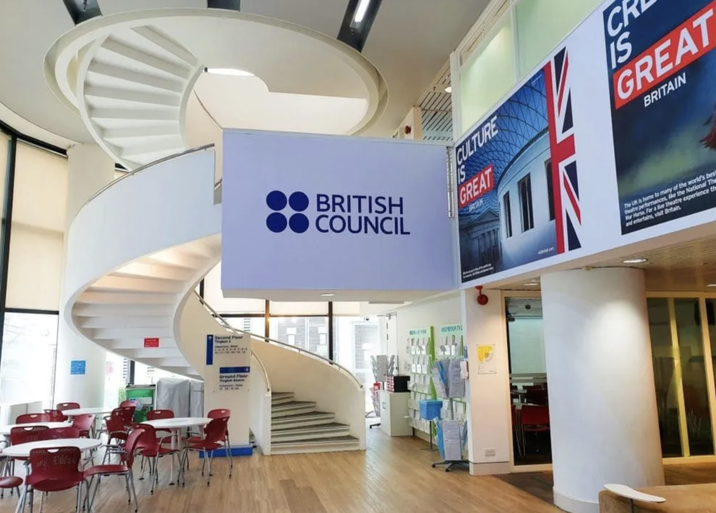
This project supported the Study UK campaign, a global initiative positioning the UK as a leading destination for international education.
Led by the British Council in partnership with the GREAT Britain Campaign, the campaign promotes the UK’s world-class higher education system and the life-changing opportunities it offers.
The focus of this work was delivering digitally-led creative content and advertising to drive awareness, engagement, and consideration among international students.
Objective
Position the UK as the first-choice study destination globally
Increase awareness of UK higher education offerings
Drive consideration and engagement among prospective students
Support recruitment efforts across priority international markets
Target Audience
The campaign targeted:
International students considering undergraduate and postgraduate study
Influencers (parents, guardians, advisors) involved in decision-making
Priority Markets
China
India
Indonesia
Malaysia
Pakistan
Nigeria
USA
France
Germany
Strategy
Digital-First Approach
The campaign was led by digital advertising, ensuring:
Scalable global reach
Precise audience targeting
Measurable performance
Channels included:
Paid social (Meta platforms)
Video content distribution
Mobile-first advertising formats
Creative Direction
Content was designed to:
Highlight the UK’s academic excellence
Showcase student life and cultural diversity
Communicate career and life-changing opportunities
The tone balanced:
Aspirational storytelling (future success, global careers)
Practical value (education quality, global recognition)
Localised Messaging
Each priority market received tailored creative, adapting:
Language and tone
Cultural relevance
Visual storytelling styles
This ensured stronger engagement across diverse international audiences.
Support high-volume e-commerce operations by producing fast, high-quality visual assets across multiple platforms and international markets.
Responsibilities
High-Volume Image Retouching Delivered large volumes of product imagery, ensuring consistency, accuracy, and premium visual standards across all listings.
Banner & Ad Design Created engaging banners for both web and print, supporting campaigns, promotions, and brand visibility.
Affiliate Page Design (WordPress) Designed and optimised affiliate landing pages to improve user experience and drive conversions.
International Marketing Assets Produced and adapted promotional ads for global markets, ensuring designs aligned with regional audiences.
Packaging Design Developed packaging visuals that aligned with brand identity and enhanced product appeal.
Impact
Improved Visual Consistency across multiple e-commerce platforms
Faster Creative Output while maintaining high-quality standards
Enhanced Campaign Performance through engaging, conversion-focused designs
Stronger Brand Presence across international markets
Summary
This role combined speed, precision, and creativity—delivering high-impact e-commerce visuals at scale while supporting global marketing efforts.
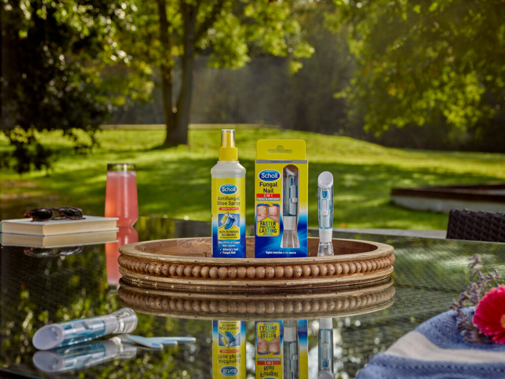
As Scholl expanded into new international markets, it faced a key challenge: how to communicate its premium footcare solutions effectively across diverse cultural and linguistic audiences.
This required more than simple translation. The brand needed high-quality transcreation, combining:
Refined visual assets
Multilingual messaging
Cultural relevance at scale
StrategyScholl – Elevating Global Footcare Through Multilingual Transcreation
To honour Scholl’s legacy while modernising its global presence, a strategic transcreation approach was implemented:
1. Cultural Relevance at Scale Existing imagery was thoughtfully adapted to resonate across different markets, ensuring cultural nuances were respected while maintaining brand integrity.
2. Premium Visual Enhancement High-end retouching elevated all visual assets, aligning them with Scholl’s premium positioning and reinforcing consumer trust.
3. Multilingual Asset Creation New assets were developed in multiple languages, ensuring messaging was not only linguistically accurate but culturally meaningful and engaging.
4. Brand Consistency Every asset remained rooted in Scholl’s core values—health, innovation, and trust—ensuring a unified global identity.
Results
Seamless Global Expansion Scholl successfully scaled its presence across international markets with culturally relevant, high-impact assets.
Elevated Brand Perception Enhanced visuals strengthened the brand’s premium image, increasing consumer confidence and appeal.
Stronger Audience Engagement Multilingual content broke down language barriers, enabling deeper connections with a broader, more diverse audience.
Preserved Brand Heritage Despite localisation, the legacy of Dr. Scholl remained intact—ensuring continuity, authenticity, and trust worldwide.
Conclusion
Scholl’s multilingual transcreation strategy demonstrates how global brands can scale without losing identity. By blending cultural sensitivity with premium execution, Scholl not only expanded its reach but strengthened its position as a trusted leader in footcare.
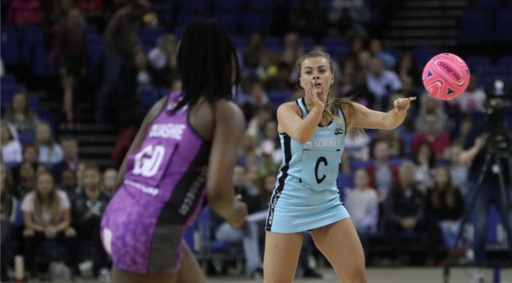
Match-standard netball built for performance at the highest level. With ultimate grip for superior handling, dribbling, and passing, this ball is crafted with a vulcanised rubber outer carcass, latex bladder, and hand-stitched construction for exceptional durability and control. Trusted at the top level and used in the Fast5 All-Stars.
Campaign Concept Led by Miki Austin, our brand ambassador, the campaign would feature a series of high-energy videos promoting each ball in the range. Using dramatic slow-motion, high-speed footage and special effects, Miki would bring each product to life with powerful hoop shots and skill-focused action sequences.
Leading E-commerce Asset Strategy and Product Promotion for the PowerGlide Cue Range
Project Overview
As part of the ongoing development and promotion of the PowerGlide cue range, I led the photography direction, image asset organisation, product listing optimisation, and e-commerce promotion strategy. The objective was to create a cohesive digital presence that showcased the latest cue construction technologies, innovation in cue design, and the expanding range of snooker cues, pool cues, cases, balls, and accessories.
The campaign also supported the launch of the “Cue for Action” promotional reel, designed to highlight the brand’s commitment to continuous improvement and modern product engineering.
My Role
I acted as the project lead for visual asset production and e-commerce optimisation, coordinating creative and commercial elements across multiple channels.
Key responsibilities included:
Leading product photography direction to ensure images met Amazon, website, and retail requirements
Organising and structuring image assets for efficient use across digital platforms
Developing SEO-optimised product titles and descriptions for e-commerce listings
Managing the visual storytelling for the “Cue for Action” promotional reel
Aligning product messaging with PowerGlide’s innovation narrative
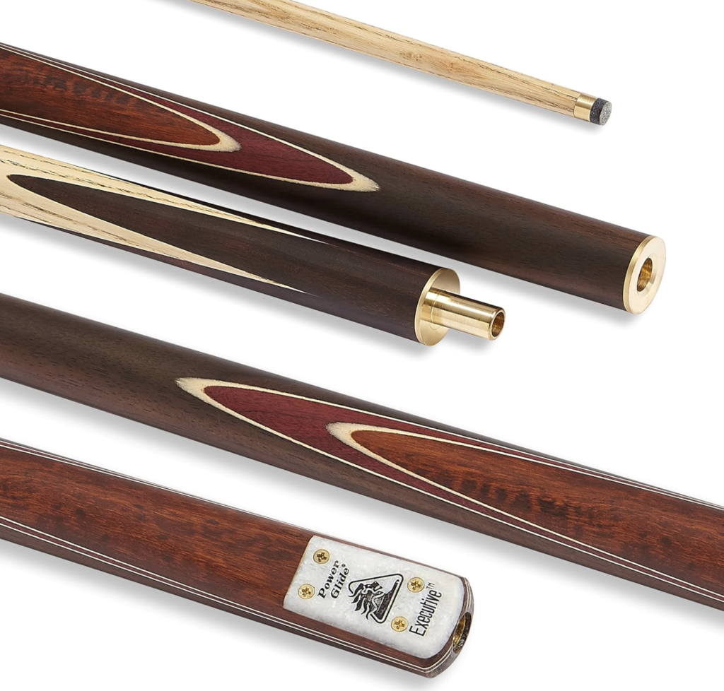
Photography and Visual Asset Leadership
To ensure the range was presented professionally across e-commerce platforms, I oversaw the full photography process, from concept through to final asset delivery.
This involved:
Planning product photography angles and compositions to highlight cue craftsmanship and materials
Creating consistent lighting and visual standards across the entire cue and accessory range
Capturing detail shots of construction technologies and finishes
Producing lifestyle imagery to showcase cues in action
Once captured, I implemented a structured digital asset management system, organising imagery by:
Product category (snooker cues, pool cues, cases, balls, accessories)
SKU and product variations
Platform format requirements (Amazon, web, social media)
This ensured efficient content reuse across marketing campaigns and product listings.
E-commerce Title Optimisation
I also developed SEO-optimised product titles to improve discoverability across e-commerce platforms.
Titles were structured to include:
Brand name (PowerGlide)
Product category (Snooker Cue, Pool Cue, Cue Case)
Key materials or technologies
Cue length or specifications
Target audience or usage
Example title structure:
PowerGlide 3/4 Jointed Snooker Cue – Precision Engineered Ash Shaft – Professional Cue with Brass Joint
This format ensured listings:
Ranked for high-intent search terms
Communicated key product benefits instantly
Were optimised for mobile browsing, where most e-commerce traffic occurs.
Promotional Content: “Cue for Action”
To support the campaign, I helped shape the visual messaging behind the “Cue for Action” promotional reel.
The reel communicated three key brand pillars:
Continuous Innovation PowerGlide constantly evolves its cue technology and design.
Complete Product Ecosystem The range includes not only cues but also cases, balls, and accessories.
Performance and Precision Highlighting the craftsmanship and advanced construction of each cue.
This short-form video was designed for:
Social media promotion
Retail partner engagement
Website and e-commerce product pages
Impact
The project delivered several key improvements to the PowerGlide product ecosystem:
Improved product visibility
Optimised titles and structured content improved search relevance.
Stronger visual brand consistency
Unified photography standards created a more premium brand presence.
Scalable asset management
Organised image libraries allowed faster deployment of marketing campaigns.
Enhanced product storytelling
The “Cue for Action” reel helped communicate innovation and craftsmanship to customers.
Key Skills Demonstrated
Creative direction and product photography management